
Understanding Your Scout Report
Your Scout Report goes beyond the numbers on a standard financial statement. It brings together current-period results, historical trends, ranked accounts, spending patterns, and vendor-level detail to give you greater context around your business's financial performance.
This guide walks you through each section of the report, explaining what you're looking at, how the different views connect, and what you can take away from the information presented.


A standard month-end statement tells you:
Operating Expenses: $85,000
The Scout Report helps you see:
-
Which expenses make up that $85,000?
-
Which ones are largest?
-
How do they compare with last year?
-
How have they moved over the last 12 periods?
-
Which spending patterns stand out?
One-Page Summary: Your Financial Picture, at a Glance.
The Scout Report begins with a one-page summary that brings together your income, costs, expenses, profitability, and spending patterns in one place. Alongside the current-period figures, trend views show how these areas have changed across periods, giving you a quick way to see where your business stands and where changes may warrant a closer look.

Income to Net Operating Income
See how income flows through the costs of running your business.
This chart shows how your income moves through the costs of providing your products or services and the operating expenses of running your business. It shows how much income remains at each stage, from gross margin through net operating income.
P&L Trend — Income, Cost of Goods, Operating Expenses
See how your income, costs, expenses, and net operating income move across periods.
This chart tracks Income, Cost of Goods Sold, Expenses, and Net Operating Income across the current period and up to 12 prior periods. Viewing these four areas together helps you see how changes in one area relate to the others and identify patterns that may not stand out when you review a single period.


Ranked Sales Categories at a Glance
See which sales categories contribute most to your income.
This chart ranks the sales categories recorded in your books and compares each category's current-period results with the same period last year. This comparison helps you see which sources of income have grown, declined, or remained relatively steady.
Income Trends
See how your sales categories have developed across periods.
This chart tracks income from each sales category across the current period and up to 12 prior periods. Comparing each category across periods helps you identify longer-term patterns and changes in how different sales categories contribute to your income.


Ranked Cost of Goods Accounts for the Current Period
See which direct costs make up the largest part of your spending.
This chart ranks your Cost of Goods accounts for the current period and compares each with the same period last year. The comparison helps you identify which direct costs have increased or decreased and where your spending has changed the most.
Cost of Goods Trends
See how the costs behind your sales have changed across periods.
This chart tracks your Cost of Goods accounts across the current period and up to 12 prior periods. Comparing these periods helps you identify which direct costs have increased, decreased, or remained relatively consistent.


Top 15 Ranked Operating Expense Accounts for the Current Period
See which operating costs make up the largest part of your spending.
This chart ranks your 15 largest operating expense accounts for the current period and compares each with the same period last year. The comparison helps you identify which operating costs have increased or decreased and where your spending has changed the most.
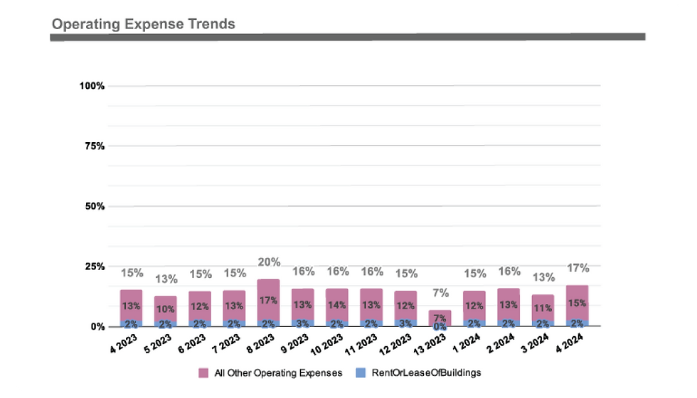
Operating Expense Trends
See how your operating costs have changed across periods.
This chart tracks your operating expense accounts across the current period and up to 12 prior periods, giving you a broader view of how your spending has developed and whether longer-term patterns are emerging.
Ranked Vendor Expenses: Cost of Goods Sold
See which vendors make up the costs of delivering what you sell.
This section ranks your Cost of Goods accounts and breaks them down by vendor, giving you a closer look at the spending directly tied to the products or services your business provides. The views that follow show how these costs relate to your year-to-date income and how spending with individual vendors has changed across periods.


Ranked Vendor Expenses: Operational Expenses
See which vendors make up the costs of running your business.
This section ranks your operating expense accounts and breaks them down by vendor, giving you a closer look at the spending involved in operating your business. The views that follow show how these costs relate to your year-to-date income and how spending with individual vendors has changed across periods.
Financial Reporting
Review the financial statements behind the analysis.
This section provides your Profit & Loss and Balance Sheet, giving you access to the underlying financial statements that support the analysis presented throughout the Scout Report. Together, they provide a detailed view of your business's income, expenses, assets, liabilities, and equity for a more complete picture of your financial position.
Profit & Loss
See where your business's income goes.
The Profit & Loss shows your income, Cost of Goods Sold, operating expenses, and net operating income across the reporting periods. It provides the underlying financial detail behind your business's revenue, costs, and expenses and helps show how those amounts contribute to your operating results.
Financial Reporting Data

Work with the data behind your financial reports.
You also receive the financial reporting data in editable spreadsheet and CSV formats, including the Profit & Loss, Balance Sheet,
and General Ledger Export. This gives you access to the underlying data in a format you can review, work with,
and use for your own analysis.